TECHSTARS MOBILITY
During my time at Techstars Mobility, the Detroit location of the Techstars accelerator family, I worked on two demo days, office signage, and countless flyers, as well as many assets for individual companies in our cohort.
We came into being as a location without much specific brand guidance from the parent company, so under the invaluable guidance of Ted Serbinski and Lisa Seymour, I built out a set of brand guidelines for our own location. We used the logo as a pattern element to make name tags, brochure backgrounds, and more.

Our office banner was roughly 8 feet high, took up most of an entire wall, and was applied with vinyl graphics. At the time, this was one of my first experiences with doing pre-press setup for vinyl signage, and it was an invaluable learning experience for me.
We did not have a logo for our cohort, so I had to design one on the fly, since we had limited time to get the signage and office set up before our first class of companies flew in. Our mobility arrow ended up being a lasting design element that got reused for several years to come.
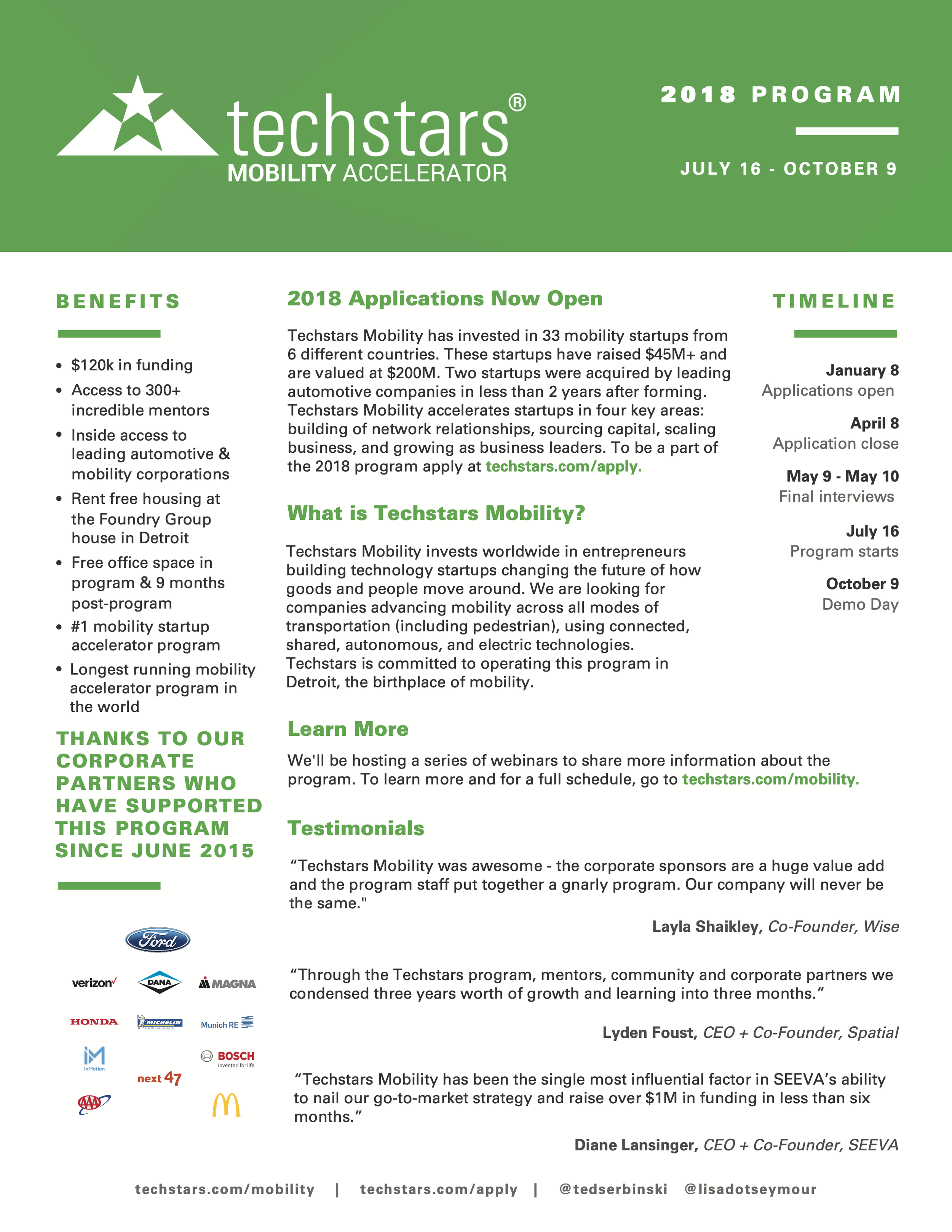
Techstars Mobility 2018 cohort informational flyer.
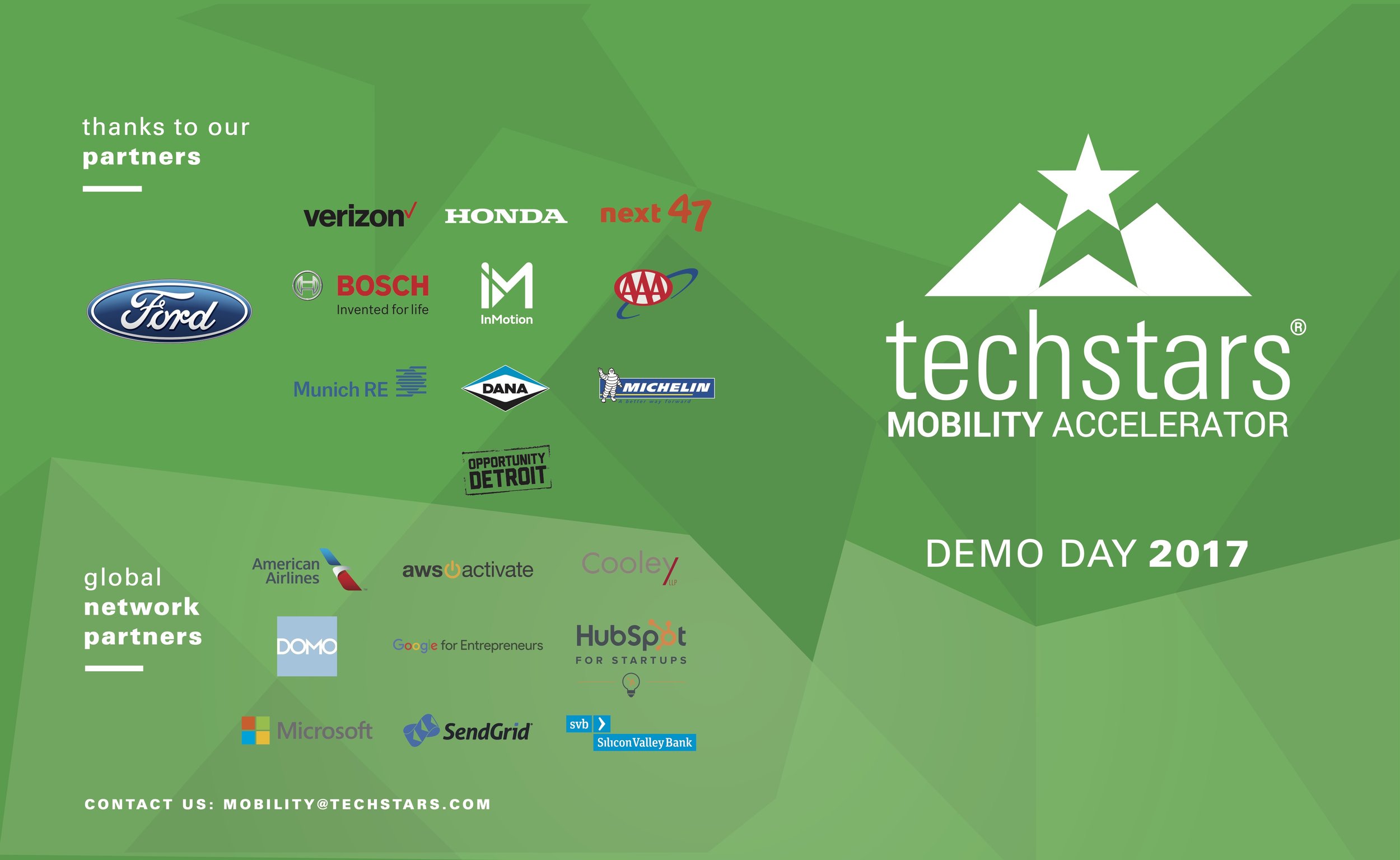
Techstars demo day 2017 brochure, back.
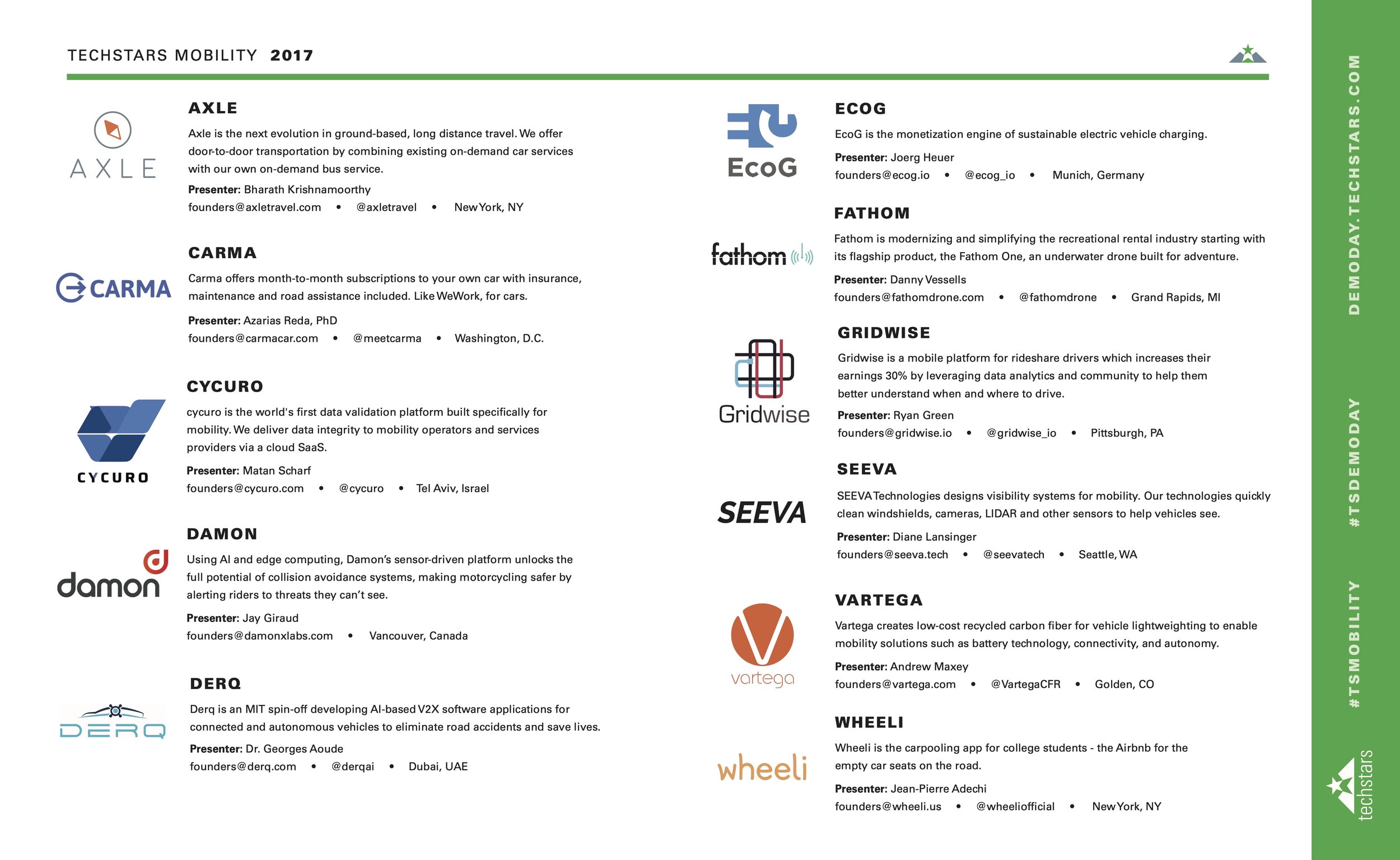
Techstars demo day 2017 brochure, interior.

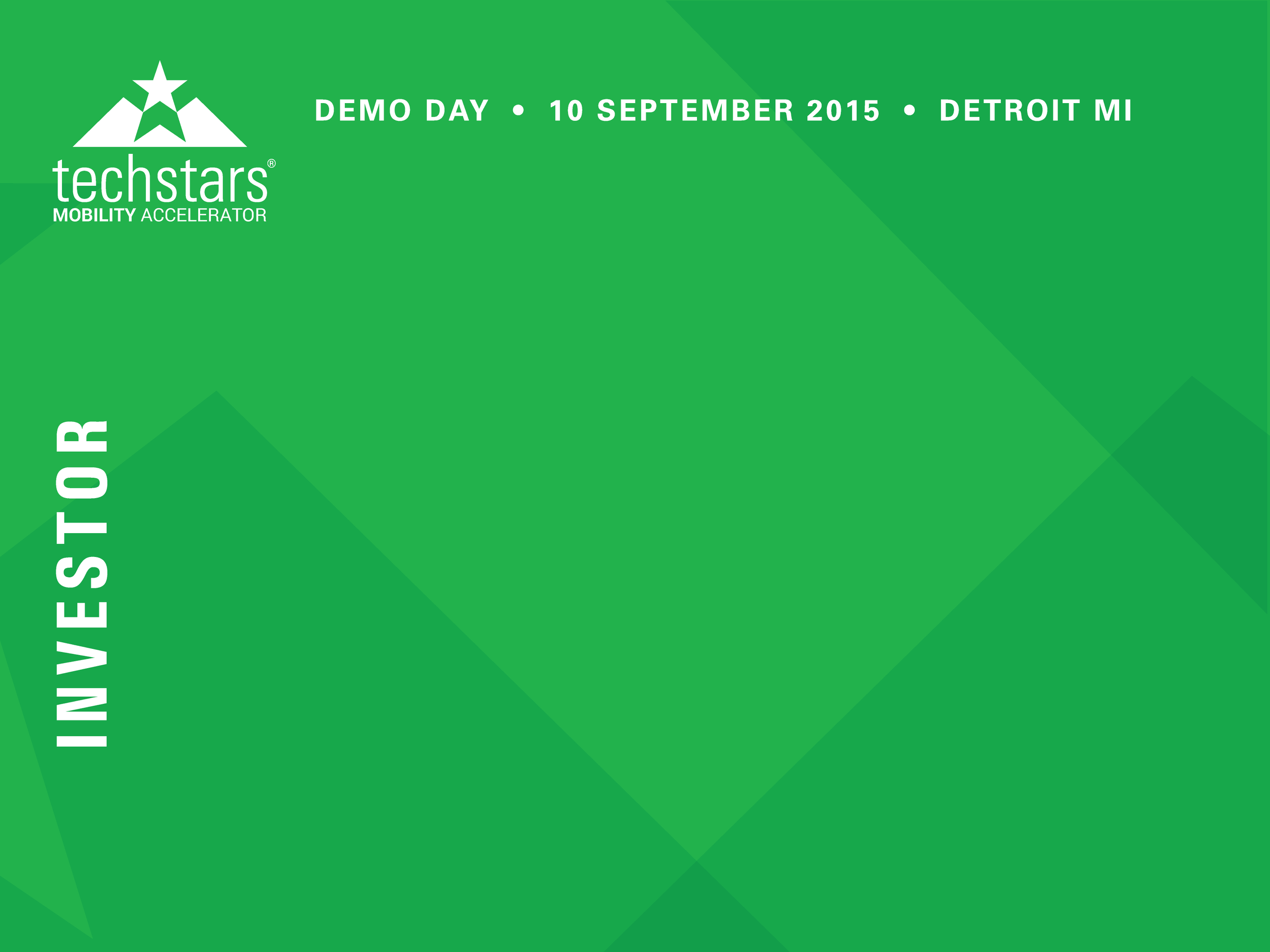
For our first demo day name tags, it was important to us that the companies could easily find and identify what type of person they needed to speak with -
after all, you don’t want to confuse an investor with a regular visitor, if you’re in search of funding.
We landed on this color coding system, which as a bonus made it incredibly easy to pass out nametags on the day of the event.