ICONS, BRANDING, LOGO, WEB DEV
CLIENT: LUNAR LABS (now SWEET)
…
Logo
A last minute copyright issue with the former name, Cosmos, required a quick turnaround and custom type work to make the new logo as similar as possible to the old one. The LUNAR font was custom drawn to look like NASA collateral from the 60s.


Building Blocks
The Lunar brand was highly visual and depends mostly on building blocks and illustrations - everything should feel round, friendly, and fun to use, without feeling too childish. Making 20-30 basic “space” shapes and combining them into new illustrations makes it easy to compose a more complex illustration on the fly.


Balls and sticks
All human animations and characters, just like the spaceships, are made of balls connected to sticks, essentially.
Keeping things simple allowed developers and non-animators to edit the images and move them around to make tweaks in a pinch.
Lunar + Community Centers
Several organizations partnered with us to help us do pilot programs of our first round of phones. We provided desktop backgrounds, in person help, and in return got feedback on the results.


Product + Delivery
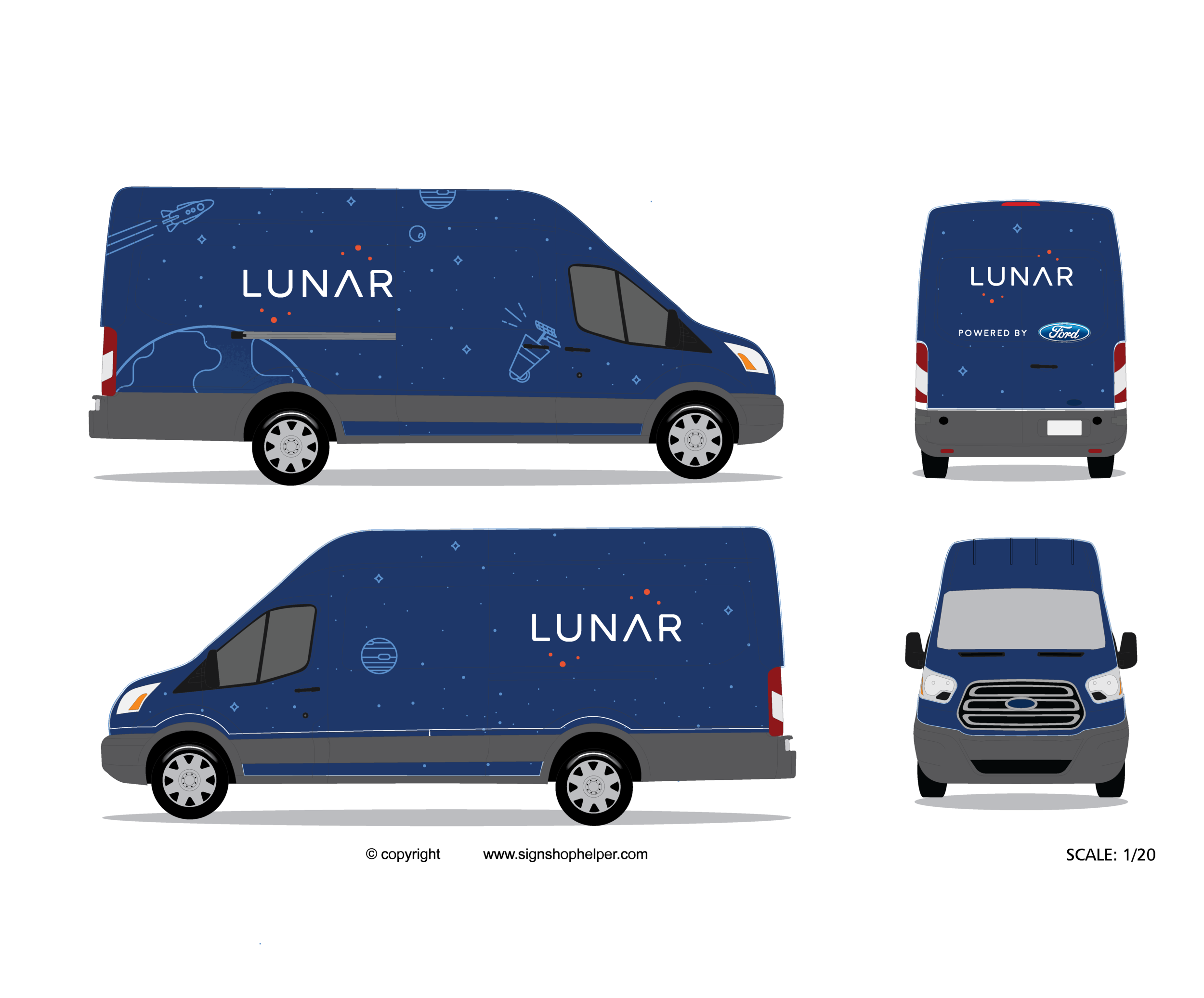
I had to create a vast amount of print and physical material for the Lunar service launch, ranging from stickers to box manufacturing to a full truck wrap. Everything was space themed and custom produced.
Packaging
We wanted to make getting a phone from Lunar an experience. Getting a smartphone is exciting, especially if you’ve never had one before, and most of the packaging on Android phones we had in stock didn’t compare to opening an Apple box. So, the only solution was to make our own box.
One of our early prototypes was this matte aqueous coated container with a sliding protective sleeve.


The Truck
Unlike other phone companies, we didn’t have stores, and our customers rarely had access to cars. The Lunar truck was essential because it brought the phone directly to homes and public locations, on demand, when customers were ready to pick up their orders. We built out a custom Ford Transit van and got it vinyl wrapped with our logo.


Stickers
Everyone likes stickers - so we made plenty of them to give away to friends, investors, customers, and anyone we could find.
Advertising
Lunar customers drove the ad campaigns from the beginning - we spent several days a month at bus stops and community centers interviewing potential customers and asking average people what they wanted from a phone plan. Then, with their permission, we let them speak for themselves through portrait posters around the city.


